By this point in your journey, you will begin to feel your self-confidence rapidly building. Those feelings of fear and anxiety should now be starting to fade away and instead, you will notice a sense of excitement beginning to build.
At this stage, you should have your business idea selected and your .com domain purchased. Congratulations! You have completed one of the hardest parts of this whole process.
QUICK NAVIGATION
1. INTRODUCTION TO OUTSOURCING
2. BUSINESS IDEA GENERATION
3. FINDING AND BUYING A GOOD .COM DOMAIN
4. LOGO DESIGN AND BRANDING
5. WEBSITE TEMPLATE SELECTION AND CUSTOMIZATION
6. SERVER SETUP AND HOSTING
7. CODING AND PROJECT WRAP UP
Committing to an idea and actually selecting a name is very easy to technically do. The hard part that myself and many other people face is building up the courage to actually take the first couple of steps. For those of you that have made it to this point you are in for a treat. This next part of the process is a lot of fun and one of my absolute favorite things that you get to do when launching a new startup.
Related: Make A Choice – Motivational Video 2016
LOGO DESIGN AND BRANDING
 It is time to finally bring everything to life and give your new project an identity. The best part is that if you follow this guide and use these strategies you should be able to get it all accomplished for five dollars!
Branding is one of the core components of any business and can help to quickly communicate with the general population several things about your website or business. Check out this example of some of the brands that we are personally working on. Can you guess what each brand might be about based on the logos?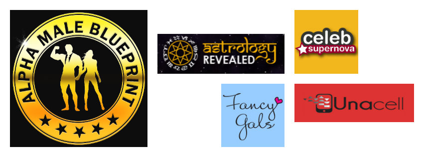 For the purpose of this guide, we are not going to discuss YouTube and video branding or social media branding. Our focus for this first step into branding our new project will be on the logo and website itself. Once those techniques are properly in place we will move to the most advanced strategies where we actually start building audiences and creating video content.
 First impressions in the online world are absolutely huge! This detailed report from conversionxl.com states that online users form a first impression within 50 milliseconds (that is 0.05 seconds!). Google also conducted their own research and suggest that it actually takes as little as 17 milliseconds! Both studies come to the same conclusion and statistically prove that first impressions do matter.
Related: The 7 Biggest Mistakes When Starting a Business
Did you know that the average user spends around 8 seconds on your website? It has also been proven that people don’t actually read websites when they first arrive, they scan it. So that means you have 50 milliseconds to make your first impression and 8 seconds to convince your new user to stick around and click on something by the end of they’re scan.
So what can we do to make sure that we achieve a great first impression and encourage new users to explore our site further?
Well, we have already done the first thing, which is to educate ourselves and understand user behavior. Now the next step is to build something awesome that people love!
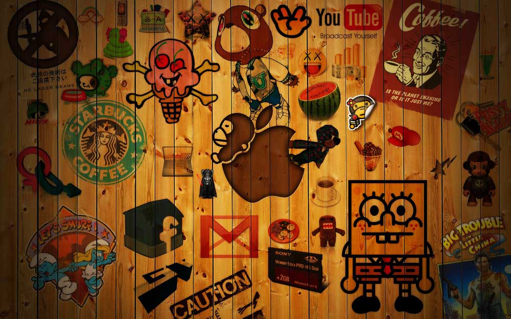
So the first thing we are going to do is grab some inspiration. Check out these examples of some of the world’s largest and most recognizable brands.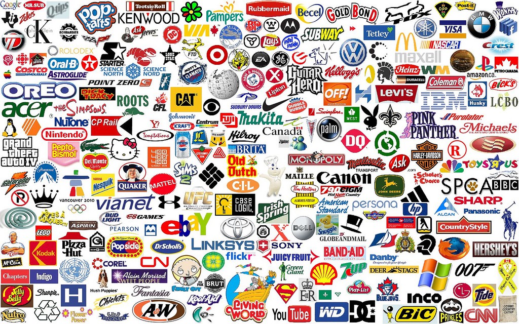 As you can see there is a massive variety of colors, fonts, and icons. Some logos are very basic while others are more complex. Through the use of color, fonts and icons each of these logos are able to produce an immediate feeling or emotion when first seen by a new user.
Now, let’s talk about the first major component, color. Colors are very closely tied to emotions and are one of the major factors that determine if someone engages with or becomes a paying customer of a brand. Check out these charts that outline the different emotions that we associate with certain colors.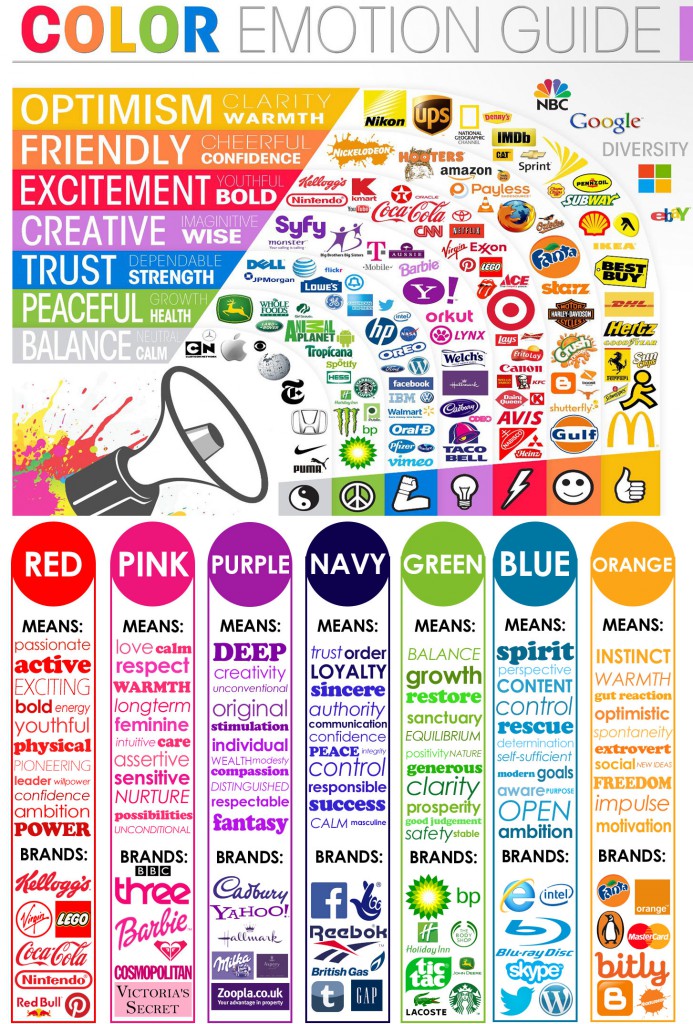 Choosing a color for your brand can seem intimidating and you might feel overwhelmed with choices. It is important to understand that there is no exact science to this whole process and these are merely guidelines and examples. Don’t be afraid to think outside of the box or to break some rules if you feel the need.
Related: How To Build Your First Website For Less Than $200 – Business Idea Generation
Some brands use more than one color and most will at the very least have some sort of complimentary color. Choosing colors that fit well together can be difficult; I found a tool that makes the process a whole lot easier.
Check out Coolers! This tool allows you to generate color schemes by pressing the spacebar (tap on mobile). When you see a color that you want to keep, click on it and it will lock it into place. You can then press the spacebar and generate more choices until you have locked in all your selections and arrived at your final color scheme. Check out an example of our scheme from Alpha Male Blueprint.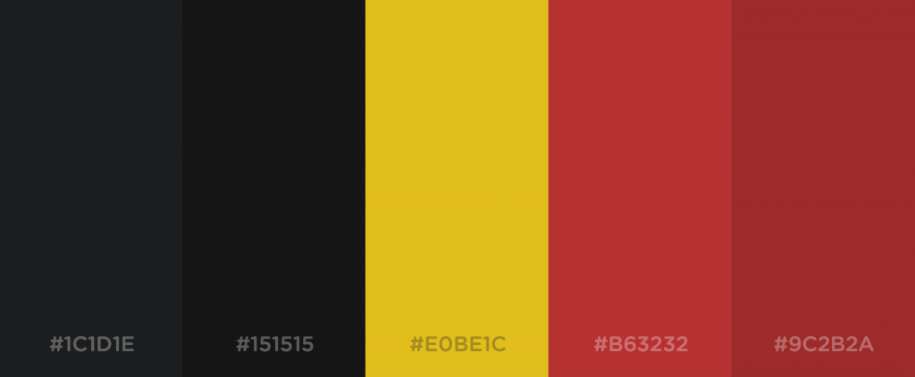 The next major component involved with a brand is the font selection. I should mention that there are actually 2 different areas when it comes to fonts. First of all, we have the font that is used for the actual logo and then we have the font that is used on the website and for daily use.
First, we will discuss our options for font selection for the actual logo and then we will take a look at some of the rules we should follow for the site itself.
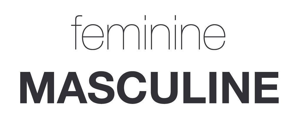
Some of the most recognizable and top brands in the world are simply a font printed out in black and white. Often we can also see logos without any text where instead symbols are used, most commonly, however, we tend to see a combination of symbols and text used to represent the majority of today’s brands.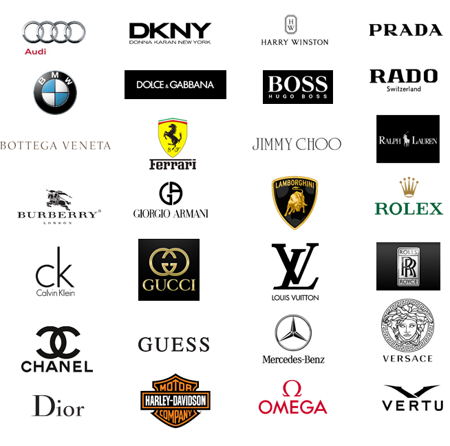 Now your font selection has the ability to say a lot about your brand upon the first impression. Your font can give off a premium vibe such as Rolex or it can give off a fun and playful vibe like LEGO. You can even target your audience by gender with your font selection and choose a font that gives your brand either a masculine or feminine feel.
 It’s important when making your selection that you consider all of these components. For example, if we go back to our Fox Web Design example from part 3 of this guide, I would personally brand this type of business as a luxury style, premium brand where I could charge premium prices for my awesome web designs. On the other hand, if I was trying to create some sort of social media advertising company, I would select something that gave less of a luxury feel and instead would try to find something that I felt represented value and trust.
Make sure you really consider these things and use this information to your advantage. The worst thing you can do is just select a logo and font without any kind of consideration simply because you think it looks cool.
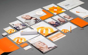 The last thing that we need to discuss about fonts is how we use them on our actual website and throughout our operation in order to represent our brand effectively. It’s important to first note that you do not need to use the same font on your website that you used for your logo. These can be considered two separate things that do not conflict or involve each other.
When selecting the font to use on your actual website the most important rule is to select something that is easily readable. You will want to avoid the urge of using cursive or tightly spaced fonts that are difficult on the eye. Keep in mind that people are scanning before they decide to read, we want to keep it clean and easy for the eye to digest.
Another unwritten rule is to select 2 to 3 fonts and to use only those fonts for your entire brands lifetime. You should select one font to be used for titles and another to be used for the body of articles and written material. A third font can be used as a call to action or auxiliary font if needed (we only use 2 fonts at AMBP). It should be noted as well that these 2 (or 3) fonts that are selected can be expanded upon with italic, bold and light versions if needed and will match the main fonts perfectly.
When using more than 3 fonts on a website, studies have shown that the user begins to feel disassociated and confused, which is certainly not what we want our brand to sub-communicate. Take a look here at a list of 20 combinations for some inspiration.
Once you have made your selection it is important to stick with it and to make sure that all your imagery and any graphics made also include your carefully selected colors and fonts. Maintaining brand consistency is what will allow people to identify and build a sense of familiarity and trust.
The last major component is the use of symbols. If you do choose to use a symbol to represent your brand it is important to either select something that actually represents your company in some way or to choose something abstract that does not potentially confuse a new user at a quick glance.
It is with the combination of colors; symbols and fonts that we are able to create the basis of a great brand that people instantly like and want to discover more about.
Related: How To Build Your First Website For Less Than $200 – How To Buy A Good .com Domain
**Alpha Pro Tip**
When I go to create a logo for a new brand I will use Google image search as my main method of attack. If I want to create a web design company I will literally search Google images for “web design logo”. I will then start scrolling through the results and look for icons, fonts or logo ideas that catch my eye. Many times my new logo will be a combination of a font that I liked from one logo and an icon taken from another, which I had combined to make my new logo.
You may likely spend hours browsing logos and fonts before coming to a decision, don’t worry I’m pretty sure this is normal as I tend to do this myself. Once you do finally make your selections it is now time to move onto the final part, getting the logo built.
For this part of the process, we are going to head over to the logo design section on Fiverr. Here, we will be able to find someone to build our new logo for us for $5.
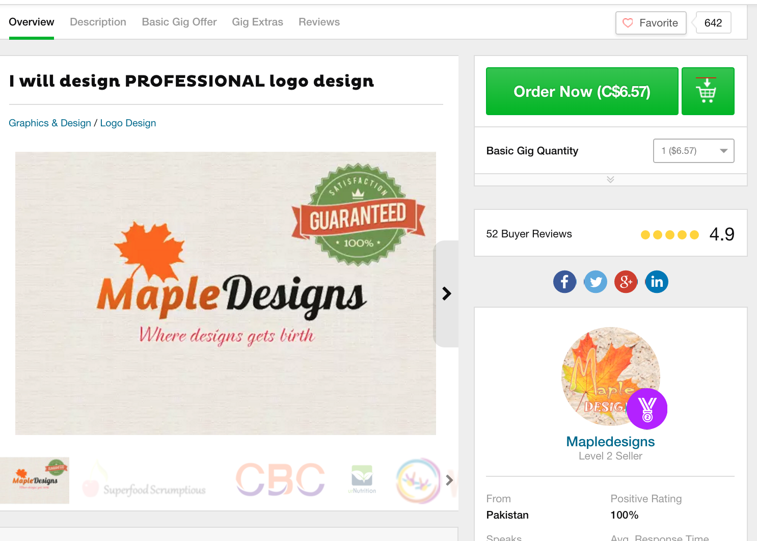 Now the first thing you want to do is start browsing portfolios. Your goal is to find someone that has a style and previous work examples that you like. Once you find someone that you think would be a good fit you can place your order and provide them with all of the details of your project.
The more details that you provide the better your chance of success. When I get a new logo made I will basically have a screenshot of the font I want to use, the colors and then the symbol that I want to be incorporated into the design. I will then provide a detailed description of the new brand along with the vibe and feel I would like it to have.
**Alpha Pro Tip**
Some designers on Fiverr will advertise for 5 dollars and then try to jack up the price on you with a bunch of “extras” that you “need”. The truth is that you can get the logo done for 5 dollars all-in, you just need to find the right designer. Sometimes if I really like a designer I will agree to pay an extra 5 bucks for the image source files, but I have never paid over $10 for a logo and neither should you.
Related: How To Build Your First Website For Less Than $200 – Introduction To Outsourcing
If you do not provide good details or if you allow the designer to do they’re own thing there is a risk that you will receive a logo that you cannot use. On the flip side, there is a chance that they might come up something better than your previous idea so it is a risk you will have to decide to take.
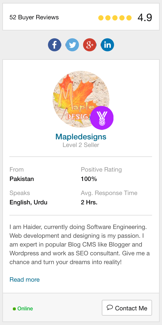 Most designers will allow for small modifications or tweaks if requested, make sure you clearly read the gig description before ordering. It is also important before purchasing a gig that you research your designer and make sure they have plenty of good ratings and comments. There are a lot of really crappy gigs on Fiverr so make sure you do your research but also understand that you are only going to risk 5 dollars and shouldn’t spend hours before pulling the trigger.
Avoid buying a logo that has a 3D effect or is emblazoned on wood or metal or is off to angle or anything strange. The first version of your new logo should be a flat version that can be used on your website and the general rule is that you should be able to put it on a letterhead and photocopy it without any issues.
Some of the things you should avoid and watch out for… It is very easy to get on this platform and to start buying stuff for your new brand that you will never use, make sure to avoid the urge to waste money on these things until you have a bit more understanding of this whole process. These gigs will always be around later so let’s not get sidetracked and start buying crap. There are many things I need to warn you about first with Fiverr.
You should never buy Facebook likes, Instagram followers, Youtube views, SEO work etc from Fiverr. All of these kinds of gigs are fully bot operated and can severely damage or ban your accounts. It is important to understand that 95% of the SEO gigs can actually harm you. Additionally buying views or followers on social media networks can not only look embarrassing because you clearly have no engagement and bought followers but also it has been proven to destroy your positioning within certain social media and search networks algorithms. Your accounts may be considered as “spam” accounts and your reach can be severely limited as a result.
I will show you some real techniques to grind out followers on social media once we get to that part. Fiverr is great for specific tasks such as translations, design work, article writing, video creating etc. What I would NOT recommend using Fiverr for is SEO, any kind of advertising (it’s usually a scam) or buying any kind of followers or views. That’s just my personal opinion and my own rule that I follow. Now it’s important to know that there are some SICK advertising and SEO gigs on here and that it is possible to get amazing things done for very cheap. With that being said you run a risk of getting some kind of bot service that you cannot stop once started or take back the effects of it after it’s done. Going from 30 followers on your personal Instagram to 10,000 will not look natural and will likely be something you regret. If you are going to experiment with these services make sure to not use them on your “money account” until you have confirmed it is exactly what you want.
Now the next part is to wait until we receive our logo design back and to request any modifications if needed. If you are satisfied with your logo you can complete the gig and leave the designer a review. If you are unhappy with your design you can ask that the designer redoes the project, leave him a bad review and complete the project or request a refund. Please keep in mind these designers are working for very cheap and many use Fiverr as their main source of income, be mindful of your reviews.
Related: Launching 5 Million Dollar Businesses In 1 Year – A Project Overview
**Alpha Pro Tip**
Make sure that you get the file in several formats including .png .jpg .psd and vector (ai). It is important to have more than just a .jpg or .png as these are basically just pictures. The other files (.psd and ai) are your actual source files where you can edit the logo.
That concludes PART 4 of this epic guide. Congratulations! You just built your first brand. What you should start to notice at this point is that building an online business might not be as hard as you originally thought… You know what is way harder? Getting up every day to go and work a job you hate!
Click here for PART 5 WEBSITE TEMPLATE SELECTION AND CUSTOMIZATION
Be phenomenal!
